widget.newButton()
类型 函数 库 widget.* 返回值 ButtonWidget 修订 版本 2024.3703 关键词 widget, button 另请参阅 ButtonWidget
概述
创建一个 ButtonWidget 对象。
语法
widget.newButton( options )
此函数接受一个参数,`options`,它是一个包含以下基本参数的表:
id (可选)
字符串。 为按钮分配的可选标识字符串。默认为 `widget_button`。
x, y (可选)
数字。 组件 **x** 和 **y** 中心点的坐标。如果定义了 `left` 和 `top` 值,则将覆盖这些值。
left, top (可选)
数字。 创建组件的左侧和顶部位置。如果指定,这些值将覆盖 `x` 和 `y` 参数。
isEnabled (可选)
布尔值。 如果为 `false`,则按钮将不响应触摸事件。使用 button:setEnabled() 在创建后启用或禁用按钮上的触摸事件。默认为 `true`(按钮已启用)。
onPress (可选)
侦听器。按下按钮时要调用的可选函数。回调函数不需要测试 `event.phase`,因为它只接受 `“began”`。
onRelease (可选)
侦听器。用户释放按钮时要调用的可选函数(假设触摸仍在按钮上方)。回调函数不需要测试 `event.phase`,因为它只接受 `“ended”`。
onEvent (可选)
侦听器。 仅在未设置 `onPress` 和 `onRelease` 时才应指定的可选函数。此回调函数允许您测试 `“began”`、`“moved”` 或 `“ended”` 的 `event.phase`。
方法
基本视觉选项
所有按钮在 `options` 表中都接受以下视觉参数,以及 双图像、双帧 或 九宫格 按钮类型构造的特定参数。
label (可选)
字符串。 将出现在按钮顶部的文本标签。
labelAlign (可选)
字符串。 按钮标签的对齐方式。有效值为 `left`、`right` 或 `center`。默认为 `center`。
labelColor (可选)
表。 包含两个 RGB+A 颜色设置的表,分别用于 **默认** 和 **悬停** 状态。
labelColor = { default={ 1, 1, 1 }, over={ 0, 0, 0, 0.5 } }
labelXOffset, labelYOffset (可选)
数字。 按钮标签的可选 **x** 和 **y** 偏移量。例如,labelYOffset = -8
font (可选)
字符串。 用于按钮标签的字体。默认为 native.systemFont。
fontSize (可选)
数字。 按钮标签的字体大小(以像素为单位)。默认为 `14`。
emboss (可选)
布尔值。 如果设置为 `true`,则按钮标签将显示为浮雕(嵌入效果)。
textOnly (可选)
布尔值。 如果设置为 `true`,则按钮将仅通过文本对象构造
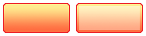
双图像构造
这是最容易构造的按钮 — 只需创建两个图像文件,一个用于 **默认** 状态,另一个用于 **悬停** 状态。
width, height (必填)
数字。 图像文件的宽度和高度。
baseDir (可选)
常量。 自定义图像所在的基本目录。默认为您的项目文件夹 (`system.ResourceDirectory`)。
defaultFile (必填)
字符串。 按钮 **默认** 图像的文件名
overFile (可选)
。字符串。按钮**悬停**图像的文件名
双帧构造
此方法使用 图像表 中的两个帧 — **默认** 和 **悬停** 状态各一个帧。对于此方法,请将对图像表的引用包含为 `sheet` 参数。然后分别将图像表中的帧号指定为 `defaultFrame` 和 `overFrame`。
sheet (必填)
ImageSheet。 按钮的 图像表 对象。
defaultFrame (必填)
数字。 按钮 **默认** 帧的索引号
overFrame (必填)
。数字。按钮**悬停**帧的索引号
形状构造
此方法允许您使用以下内置 Corona 形状对象创建按钮:
shape (必填)
字符串。 定义用于按钮主体(背景)的形状。有效选项为 `“rect”`、`“roundedRect”`、`“circle”` 或 `“polygon”`。
fillColor (可选)
表。 包含两个 RGB+A 颜色设置的表,分别用于默认和悬停状态。这些颜色定义形状的填充颜色。
fillColor = { default={ 1, 0.2, 0.5, 0.7 }, over={ 1, 0.2, 0.5, 1 } }
strokeColor (可选)
表。 包含两个 RGB+A 颜色设置的表,分别用于默认和悬停状态。这些颜色定义形状的描边颜色。
strokeColor = { default={ 0, 0, 0 }, over={ 0.4, 0.1, 0.2 } }
strokeWidth (可选)
数字。 形状对象周围描边的宽度。仅在定义了 `strokeColor` 时适用。
width, height (可选)
数字。 按钮形状的宽度和高度。仅适用于 `“rect”` 或 `“roundedRect”` 形状。
cornerRadius (可选)
数字。 `“roundedRect”` 形状的圆角半径。所有其他形状都将忽略此值。
radius (可选)
数字。 `“circle”` 形状的半径。所有其他形状都将忽略此值。
vertices (可选)
数组。 用于定义 `“polygon”` 形状的 **x** 和 **y** 坐标数组。这些坐标将自动
vertices = { -20, -25, 40, 0, -20, 25 }
九宫格构造
此方法使用 图像表 中的 9 个切片,这些切片在内部组合以创建

width, height (必填)
数字。 九宫格按钮的灵活宽度和高度。
sheet (必填)
ImageSheet。 按钮的 图像表 对象。
middleFrame, middleOverFrame (必填)
数字。 **默认**
topLeftFrame, topLeftOverFrame (必填)
数字。 **默认**
topMiddleFrame, topMiddleOverFrame (必填)
数字。 **默认**
topRightFrame, topRightOverFrame (必填)
数字。 **默认**
middleRightFrame, middleRightOverFrame (必填)
数字。 **默认**
bottomRightFrame, bottomRightOverFrame (必填)
数字。 **默认**
bottomMiddleFrame, bottomMiddleOverFrame (必填)
数字。 **默认**
bottomLeftFrame, bottomLeftOverFrame (必填)
数字。 **默认**
middleLeftFrame, middleLeftOverFrame (必填)
数字。 **默认**
示例
默认
local widget = require( "widget" )

-- Function to handle button events
local function handleButtonEvent( event )

    if ( "ended" == event.phase ) then
        print( "Button was pressed and released" )
    end
end

-- Create the widget
local button1 = widget.newButton(
    {
        left = 100,
        top = 200,
        id = "button1",
        label = "Default",
        onEvent = handleButtonEvent
    }
)
双图像
local widget = require( "widget" )

-- Function to handle button events
local function handleButtonEvent( event )

    if ( "ended" == event.phase ) then
        print( "Button was pressed and released" )
    end
end

local button1 = widget.newButton(
    {
        width = 240,
        height = 120,
        defaultFile = "buttonDefault.png",
        overFile = "buttonOver.png",
        label = "button",
        onEvent = handleButtonEvent
    }
)

-- Center the button
button1.x = display.contentCenterX
button1.y = display.contentCenterY

-- Change the button's label text
button1:setLabel( "2-Image" )
双帧
local widget = require( "widget" )

-- Function to handle button events
local function handleButtonEvent( event )

    if ( "ended" == event.phase ) then
        print( "Button was pressed and released" )
    end
end

-- Image sheet options and declaration
-- For testing, you may copy/save the image under "2-Frame Construction" above
local options = {
    width = 240,
    height = 120,
    numFrames = 2,
    sheetContentWidth = 480,
    sheetContentHeight = 120
}
local buttonSheet = graphics.newImageSheet( "widget-button-file.png", options )

-- Create the widget
local button1 = widget.newButton(
    {
        sheet = buttonSheet,
        defaultFrame = 1,
        overFrame = 2,
        label = "button",
        onEvent = handleButtonEvent
    }
)

-- Center the button
button1.x = display.contentCenterX
button1.y = display.contentCenterY

-- Change the button's label text
button1:setLabel( "2-Frame" )
形状
local widget = require( "widget" )

-- Function to handle button events
local function handleButtonEvent( event )

    if ( "ended" == event.phase ) then
        print( "Button was pressed and released" )
    end
end

-- Create the widget
local button1 = widget.newButton(
    {
        label = "button",
        onEvent = handleButtonEvent,
        emboss = false,
        -- Properties for a rounded rectangle button
        shape = "roundedRect",
        width = 200,
        height = 40,
        cornerRadius = 2,
        fillColor = { default={1,0,0,1}, over={1,0.1,0.7,0.4} },
        strokeColor = { default={1,0.4,0,1}, over={0.8,0.8,1,1} },
        strokeWidth = 4
    }
)

-- Center the button
button1.x = display.contentCenterX
button1.y = display.contentCenterY

-- Change the button's label text
button1:setLabel( "Shape" )
九宫格
local widget = require( "widget" )

-- Function to handle button events
local function handleButtonEvent( event )

    if ( "ended" == event.phase ) then
        print( "Button was pressed and released" )
    end
end

-- Image sheet options and declaration
-- For testing, you may copy/save the image under "9-Slice Construction" above
local options = {
    frames =
    {
        { x=0, y=0, width=21, height=21 },
        { x=21, y=0, width=198, height=21 },
        { x=219, y=0, width=21, height=21 },
        { x=0, y=21, width=21, height=78 },
        { x=21, y=21, width=198, height=78 },
        { x=219, y=21, width=21, height=78 },
        { x=0, y=99, width=21, height=21 },
        { x=21, y=99, width=198, height=21 },
        { x=219, y=99, width=21, height=21 },
        { x=240, y=0, width=21, height=21 },
        { x=261, y=0, width=198, height=21 },
        { x=459, y=0, width=21, height=21 },
        { x=240, y=21, width=21, height=78 },
        { x=261, y=21, width=198, height=78 },
        { x=459, y=21, width=21, height=78 },
        { x=240, y=99, width=21, height=21 },
        { x=261, y=99, width=198, height=21 },
        { x=459, y=99, width=21, height=21 }
    },
    sheetContentWidth = 480,
    sheetContentHeight = 120
}
local buttonSheet = graphics.newImageSheet( "widget-button-9slice.png", options )

-- Create the widget
local button1 = widget.newButton(
    {
        width = 340,
        height = 100,
        sheet = buttonSheet,
        topLeftFrame = 1,
        topMiddleFrame = 2,
        topRightFrame = 3,
        middleLeftFrame = 4,
        middleFrame = 5,
        middleRightFrame = 6,
        bottomLeftFrame = 7,
        bottomMiddleFrame = 8,
        bottomRightFrame = 9,
        topLeftOverFrame = 10,
        topMiddleOverFrame = 11,
        topRightOverFrame = 12,
        middleLeftOverFrame = 13,
        middleOverFrame = 14,
        middleRightOverFrame = 15,
        bottomLeftOverFrame = 16,
        bottomMiddleOverFrame = 17,
        bottomRightOverFrame = 18,
        label = "button"
    }
)

-- Center the button
button1.x = display.contentCenterX
button1.y = display.contentCenterY

-- Change the button's label text
button1:setLabel( "9-Slice" )