widget.newPickerWheel()
类型 函数 库 widget.* 返回值 PickerWheelWidget 修订 版本 2024.3703 关键词 widget, picker, pickerWheel 另请参阅 PickerWheelWidget
概述
创建一个 PickerWheelWidget 对象。
陷阱
为了节省纹理内存,PickerWheelWidget 对象只能使用 图像表单 进行视觉自定义。
PickerWheelWidget 对象不支持 缩放,也不支持通过 .width 或 .height 更改宽度/高度。如果您想实现一个
自定义大小 的选择器轮以适应您的用户界面,请参阅下面的 可调整大小的构造。
语法
widget.newPickerWheel( options )
此函数接受一个参数 `options`,它是一个包含以下参数的表:
id (可选)
字符串。要分配给选择器轮的可选标识符。默认为 `widget_pickerWheel`。
x, y (可选)
数字。控件 **x** 和 **y** 中心点的坐标。如果定义了 `left` 和 `top` 值,则这些值将被覆盖。
left, top (可选)
数字。创建控件的左侧和顶部位置。如果指定,则这些值将覆盖 `x` 和 `y` 参数。
columns (必填)
style (可选)
字符串。指示选择器轮的构造样式。如果设置为 `"resizable"`,则构造将遵循 可调整大小的构造 中概述的设计。如果省略,则构造将遵循 320×222 的固定大小。
onValueSelected (可选)
侦听器。当用户在选择器轮中选择一个项目时或调用 object:selectValue() 时触发的可选侦听器函数。
方法
object:getValues()
object:selectValue()
配置列
选择器轮中的列由一系列有序的
`columns` 表中的每个子表都接受以下参数:
labels (必填)
表。一个有序值表,表示列中每一行的标签。例如:
labels = { "Monday", "Tuesday", "Wednesday", "Thursday", "Friday", "Saturday", "Sunday" }
width (可选)
数字。默认情况下,列在选择器轮的可视区域之间平均分配,但可以通过 `width` 属性定义列的宽度 — 这允许您调整每个列的宽度以更好地适应其定义的标签。
align (可选)
字符串。指定列中文本标签的对齐方式。可接受的值为 `"left"`、`"center"` 或 `"right"`。默认为 `"center"`。
labelPadding (可选)
数字。用于填充/偏移选择器列标签的可选像素数。如果 `align` 设置为 `"left"`,则填充将从列的左边缘开始;如果 `align` 设置为 `"right"`,则填充将从列的右边缘开始。
startIndex (必填)
数字。列的
基本视觉选项
font (可选)
字符串。用于选择器轮列条目的字体。默认为 native.systemFont。
fontSize (可选)
数字。选择器轮列条目的字体大小(以像素为单位)。默认为 `22`。
fontColor (可选)
表。指定“未选中”选择器轮标签字体颜色的 RGB+A 颜色表。
fontColor = { 0.2, 0.2, 0.2 }
fontColorSelected (可选)
表。指定“选中”选择器轮标签字体颜色的 RGB+A 颜色表。
fontColorSelected = { 1, 0, 0 }
columnColor (可选)
表。指定选择器轮列背景颜色的 RGB+A 颜色设置表。
columnColor = { 0.8, 0.8, 0.8 }
可调整大小的构造
可以构造适合您用户界面大小的可调整大小的选择器轮 — 只需在控件构造函数参数中将 `style` 设置为 `"resizable"` 并包含以下额外的必填参数:
边框/覆盖框构造是可选的,但如果要包含边框,则必须指定构造它所需的**所有**帧索引(总共八个)。
可调整大小的选择器轮**不**兼容旧控件主题。如果您正在实现可调整大小的选择器轮,则应通过 widget.setTheme() 显式设置
非旧版 主题,例如 `"widget_theme_android_holo_dark"`、`"widget_theme_android_holo_light"` 或 `"widget_theme_ios7"`。
width (必填)
数字。设置选择器轮总宽度的整数。
rowHeight (必填)
数字。设置选择器轮列中每行高度的整数。因为选择器轮被严格设计为显示 5 行 — 用于选中选项的中心选择行以及上下各两行 — 选择器轮的总高度将是此值的 5 倍。例如,如果您将 `rowHeight` 设置为 `40`,则生成的选择器轮的总高度为 200 像素。
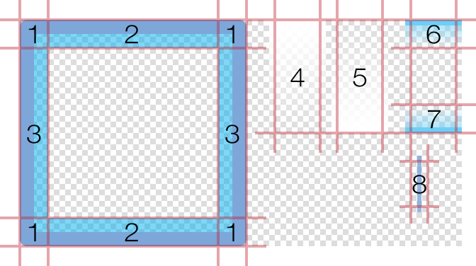
此外,您可以使用 图像表单 中的帧来自定义可调整大小的选择器轮的视觉效果。如下图所示,这包括:
- 由以下部分构造的可选边框覆盖层,包含八个帧:
四个角 (**1**) 、上/下水平跨度 (**2**) 和左/右垂直跨度 (**3**) 。跨度帧将被拉伸以填充角帧之间的空间。 - 可选的
顶部淡入淡出跨度 (**4**) 和底部淡入淡出跨度 (**5**) 。它们将被拉伸到选择器轮的整个宽度。 - 可选的上部和下部帧
(**6** 和 **7**) ,它们跨越垂直中心以突出显示“选择”行。它们将被拉伸到选择器轮的整个宽度。 - 列之间将自动放置的可选分隔符/分隔线(**8**)(位于边框覆盖层下方和其他元素上方)。
sheet (必填)
ImageSheet。选择器轮的 图像表单 对象。
topLeftFrame (可选)
数字。
topMiddleFrame (可选)
数字。
topRightFrame (可选)
数字。
middleLeftFrame (可选)
数字。
middleRightFrame (可选)
数字。
bottomLeftFrame (可选)
数字。
bottomMiddleFrame (可选)
数字。
bottomRightFrame (可选)
数字。
topFadeFrame (可选)
数字。顶部淡入淡出帧的索引号。此帧位于边框/覆盖层下方和选择器轮列上方。其顶部边缘与选择器轮的顶部对齐,并拉伸以跨越定义的宽度。这可以用来模拟列标签移到轮子顶部边缘之外时的视觉
bottomFadeFrame (可选)
数字。底部淡入淡出帧的索引号。此帧位于边框/覆盖层下方和选择器轮列上方。其底部边缘与选择器轮的底部对齐,并拉伸以跨越定义的宽度。这可以用来模拟列标签移到轮子底部边缘之外时的视觉
middleSpanTopFrame (可选)
效果。
middleSpanBottomFrame (可选)
数字。上部中间跨度帧的索引号。此帧位于边框/覆盖层下方和选择器轮列上方。其顶部边缘与选择器轮中心选择行的顶部边缘对齐,并拉伸以跨越定义的宽度。如果需要,可以通过 `middleSpanOffset` 调整垂直对齐方式,如下所述。
backgroundFrame (可选)
数字。位于选择器轮后面的背景帧的索引号。此帧将被拉伸以跨越选择器轮的定义宽度和构造高度。
separatorFrame (可选)
数字. 分隔符/分隔线框架的索引号。这些分隔符将自动放置在列之间,并会拉伸以跨越构造的高度。
middleSpanOffset (可选)
数字. 上部和下部中间跨度框架的偏移值。如果为正值,则此值会将 middleSpanTopFrame 向上偏移,并将 middleSpanBottomFrame 向下偏移,使其偏离默认位置。这可以用来调整跨度框架相对于中心选择行的“展开”程度。允许使用负值。
borderPadding (可选)
数字. 在所有侧边填充边框/覆盖层的像素数。这可以用于将边框框架扩展到选择器轮定义的宽度和构造高度之外。
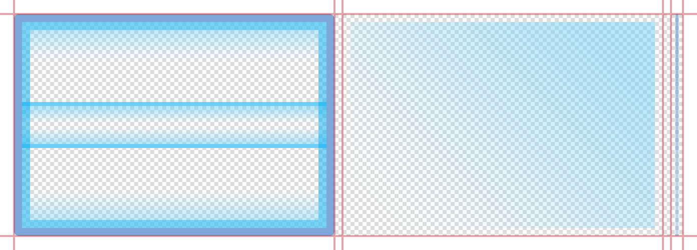
固定大小自定义
固定大小的选择器轮可以使用来自 图像表 的框架进行视觉定制。如下图所示,它由三个框架组成:一个覆盖层(左)、一个位于覆盖层后面的背景框架(中)和一个可选的分隔符/分隔线(右),该分隔符/分隔线将自动放置在列之间(在覆盖层下方和背景上方)。
sheet (必填)
ImageSheet。选择器轮的 图像表单 对象。
overlayFrame (可选)
数字. 覆盖层边缘/边框框架的索引号。
backgroundFrame (可选)
数字. 选择器轮后面的背景框架的索引号。
separatorFrame (可选)
数字. 分隔符/分隔线框架的索引号。这些分隔符将自动放置在列之间。
固定大小的选择器轮的尺寸严格为 320×222 像素(宽×高)。如果您需要一个
自定义大小 选择器轮,请参阅上面的可调整大小的构造。在实现
固定大小的 选择器轮时,所有列的总宽度应为 280 像素,左右两侧各留 20 像素的边框。
示例
默认 — 可调整大小
local widget = require( "widget" )

-- Set up the picker wheel columns
local columnData =
{
    {
        align = "left",
        width = 124,
        labelPadding = 20,
        startIndex = 2,
        labels = { "Hoodie", "Short Sleeve", "Long Sleeve", "Sweatshirt" }
    },
    {
        align = "left",
        width = 96,
        labelPadding = 10,
        startIndex = 1,
        labels = { "Dark Grey", "White", "Black", "Orange" }
    },
    {
        align = "left",
        width = 60,
        labelPadding = 10,
        startIndex = 3,
        labels = { "S", "M", "L", "XL", "XXL" }
    }
}

-- Create the widget
local pickerWheel = widget.newPickerWheel(
{
    x = display.contentCenterX,
    top = display.contentHeight - 160,
    columns = columnData,
    style = "resizable",
    width = 280,
    rowHeight = 32,
    fontSize = 14
})

-- Get the table of current values for all columns
-- This can be performed on a button tap, timer execution, or other event
local values = pickerWheel:getValues()

-- Get the value for each column in the wheel, by column index
local currentStyle = values[1].value
local currentColor = values[2].value
local currentSize = values[3].value

print( currentStyle, currentColor, currentSize )
默认 — 固定大小
local widget = require( "widget" )

-- Set up the picker wheel columns
local columnData =
{
    {
        align = "left",
        width = 126,
        startIndex = 2,
        labels = { "Hoodie", "Short Sleeve", "Long Sleeve", "Sweatshirt" }
    },
    {
        align = "left",
        width = 106,
        labelPadding = 10,
        startIndex = 1,
        labels = { "Dark Grey", "White", "Black", "Orange" }
    },
    {
        align = "left",
        labelPadding = 10,
        startIndex = 3,
        labels = { "S", "M", "L", "XL", "XXL" }
    }
}

-- Create the widget
local pickerWheel = widget.newPickerWheel(
{
    x = display.contentCenterX,
    top = display.contentHeight - 222,
    fontSize = 18,
    columns = columnData
})

-- Get the table of current values for all columns
-- This can be performed on a button tap, timer execution, or other event
local values = pickerWheel:getValues()

-- Get the value for each column in the wheel, by column index
local currentStyle = values[1].value
local currentColor = values[2].value
local currentSize = values[3].value

print( currentStyle, currentColor, currentSize )
图像表单 — 可调整大小
local widget = require( "widget" )

-- Set up the picker wheel columns
local columnData =
{
    {
        align = "left",
        width = 124,
        labelPadding = 20,
        startIndex = 2,
        labels = { "Hoodie", "Short Sleeve", "Long Sleeve", "Sweatshirt" }
    },
    {
        align = "left",
        width = 96,
        labelPadding = 10,
        startIndex = 1,
        labels = { "Dark Grey", "White", "Black", "Orange" }
    },
    {
        align = "left",
        width = 60,
        labelPadding = 10,
        startIndex = 3,
        labels = { "S", "M", "L", "XL", "XXL" }
    }
}

-- Image sheet options and declaration
local options = {
    frames =
    {
        { x=0, y=0, width=20, height=20 },
        { x=20, y=0, width=120, height=20 },
        { x=140, y=0, width=20, height=20 },
        { x=0, y=20, width=20, height=120 },
        { x=140, y=20, width=20, height=120 },
        { x=0, y=140, width=20, height=20 },
        { x=20, y=140, width=120, height=20 },
        { x=140, y=140, width=20, height=20 },
        { x=180, y=0, width=32, height=80 },
        { x=224, y=0, width=32, height=80 },
        { x=276, y=0, width=32, height=20 },
        { x=276, y=60, width=32, height=20 },
        { x=276, y=100, width=12, height=32 }
    },
    sheetContentWidth = 312,
    sheetContentHeight = 160
}
local pickerWheelSheet = graphics.newImageSheet( "widget-pickerwheel-resizable.png", options )

-- Create the widget
local pickerWheel = widget.newPickerWheel(
{
    x = display.contentCenterX,
    top = display.contentHeight - 176,
    columns = columnData,
    style = "resizable",
    width = 280,
    rowHeight = 32,
    fontSize = 14,
    sheet = pickerWheelSheet,
    topLeftFrame = 1,
    topMiddleFrame = 2,
    topRightFrame = 3,
    middleLeftFrame = 4,
    middleRightFrame = 5,
    bottomLeftFrame = 6,
    bottomMiddleFrame = 7,
    bottomRightFrame = 8,
    topFadeFrame = 9,
    bottomFadeFrame = 10,
    middleSpanTopFrame = 11,
    middleSpanBottomFrame = 12,
    separatorFrame = 13,
    middleSpanOffset = 4,
    borderPadding = 8
})

-- Get the table of current values for all columns
-- This can be performed on a button tap, timer execution, or other event
local values = pickerWheel:getValues()

-- Get the value for each column in the wheel, by column index
local currentStyle = values[1].value
local currentColor = values[2].value
local currentSize = values[3].value

print( currentStyle, currentColor, currentSize )
图像表单 — 固定大小
local widget = require( "widget" )

-- Set up the picker wheel columns
local columnData =
{
    {
        align = "left",
        width = 126,
        startIndex = 2,
        labels = { "Hoodie", "Short Sleeve", "Long Sleeve", "Sweatshirt" }
    },
    {
        align = "left",
        width = 106,
        labelPadding = 10,
        startIndex = 1,
        labels = { "Dark Grey", "White", "Black", "Orange" }
    },
    {
        align = "left",
        labelPadding = 10,
        startIndex = 3,
        labels = { "S", "M", "L", "XL", "XXL" }
    }
}

-- Image sheet options and declaration
local options = {
    frames =
    {
        { x=0, y=0, width=320, height=222 },
        { x=328, y=0, width=320, height=222 },
        { x=656, y=0, width=12, height=222 }
    },
    sheetContentWidth = 668,
    sheetContentHeight = 222
}
local pickerWheelSheet = graphics.newImageSheet( "widget-pickerwheel-standard.png", options )

-- Create the widget
local pickerWheel = widget.newPickerWheel(
{
    x = display.contentCenterX,
    top = display.contentHeight - 222,
    columns = columnData,
    fontSize = 18,
    sheet = pickerWheelSheet,
    overlayFrame = 1,
    backgroundFrame = 2,
    separatorFrame = 3
})

-- Get the table of current values for all columns
-- This can be performed on a button tap, timer execution, or other event
local values = pickerWheel:getValues()

-- Get the value for each column in the wheel, by column index
local currentStyle = values[1].value
local currentColor = values[2].value
local currentSize = values[3].value

print( currentStyle, currentColor, currentSize )