widget.newTabBar()
类型 函数 库 widget.* 返回值 TabBarWidget 修订版 版本 2024.3703 关键词 widget、选项卡栏、选项卡、选项卡按钮 另请参阅 TabBarWidget
概述
创建 TabBarWidget 对象。
麻烦
TabBarWidget 对象不支持通过 缩放 或通过 .width 或 .height 更改宽度/高度。
TabBarWidget 对象不支持创建后更改 anchorX 或 anchorY 属性。
语法
widget.newTabBar( options )
此函数采用一个参数:options,这是一个表,该表接受以下参数:
id (可选)
字符串. 分配给选项卡栏的可选标识。默认值为 widget_tabBar。
x、y (可选)
数字. 小组件的 x 和 y 中心点的坐标。如果定义了 left 和 top,这些值将被它们覆盖。
left、top (可选)
数字. 创建小组件的左上角位置。如果已指定,则这些值将覆盖 x 和 y 参数。
width、height (可选)
数字. 选项卡栏的宽度和高度(以像素为单位)。默认高度为 52。
方法
object:setSelected()
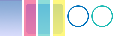
视觉定制 — 图像文件
TabBarWidget 对象可以使用各个图像文件进行视觉自定义。这些文件包括
- 跨栏宽和高的可选背景图像(图表中的左侧渐变色)
- 三个大小相等的可选图像文件,用于选项卡高亮度叠加层(图表中的红色、绿色和黄色)
- 为每个指定的选项卡按钮提供的两个可选图像文件,这些文件叠加在栏上(图表中的环状图像)
 |
→ |  |
baseDir (可选)
Constant. 存放自定义图像的基本目录。默认值为项目文件夹 (system.ResourceDirectory)。
backgroundFile (可选)
String. 选项卡栏的背景图像文件。此文件可能设计为宽高灵活。
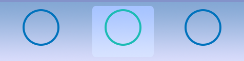
突出显示覆盖
您可以配置可选高亮度叠加层,该叠加层将位于背景前面,但位于可选按钮图像后面。高亮度叠加层由一个左、中、右图像文件组成,每个图像文件应设计为大小相等。但是,如果选项卡宽度大于这三个图像文件总宽度,叠加层将拉伸以适合选项卡的宽度。在这种情况下,左边缘图像和右边缘图像将保持其原始大小,而中间部分将拉伸以填补两者之间的距离。
tabSelectedLeftFile (必需)
String. 选项卡高亮度叠加层的左边缘图像文件。
tabSelectedMiddleFile (必需)
String. 选项卡高亮度叠加层的中间图像文件。此文件应设计为宽高灵活。
tabSelectedRightFile (必需)
String. 选项卡高亮度叠加层的右边缘图像文件。
tabSelectedFrameWidth、tabSelectedFrameHeight (必需)
Numbers. 每个高亮度叠加层图像的宽度和高度。所有三个部分应设计为大小相等。
视觉定制 — 图像图层
TabBarWidget 对象可以使用 图像图层 中的帧来进行视觉自定义。这些帧包括
- 跨栏宽和高的可选背景帧(图表中的左侧渐变色)
- 三个大小相等的可选图像帧,用于选项卡高亮度叠加层(图表中的红色、绿色和黄色)
- 为每个指定选项卡按钮提供两个可选图像框架,覆盖栏(图表中的环形图像)
 |
→ | |
sheet (必需)
ImageSheet。图像 图纸选项卡栏对象。
backgroundFrame (可选)
字符串。选项卡栏的背景图像框架。这可以设计成灵活的宽度/高度。
backgroundFrameWidth、backgroundFrameHeight (必需)
数字。背景框架的宽度和高度。
突出显示覆盖
您可以配置可选的高亮叠加层,它将放在背景的前面,但在可选按钮图像的后面。高亮叠加层由左右中三个图像框架组成,每个图像框架的大小都应相等。但是,如果选项卡的宽度比这三个图像框架的总宽度大,叠加层将拉伸以适应选项卡的宽度。在这种情况下,左右边缘框架将保持其原始大小,而中间部分将拉伸以填充之间的距离。
tabSelectedLeftFrame (必需)
字符串。用于选项卡高亮叠加层的左侧边缘图像框架。
tabSelectedMiddleFrame (必需)
字符串。用于选项卡高亮叠加层的中间图像框架。这应该被设计成在宽度上是灵活的。
tabSelectedRightFrame (必需)
字符串。用于选项卡高亮叠加层的右侧边缘图像框架。
tabSelectedFrameWidth、tabSelectedFrameHeight (必需)
数字。每个高亮叠加层框架的宽度和高度。所有三个部分的大小都应相等。
示例
默认
local widget = require( "widget" )

-- Function to handle button events
local function handleTabBarEvent( event )
    print( event.target.id )  -- Reference to button's 'id' parameter
end

-- Configure the tab buttons to appear within the bar
local tabButtons = {
    {
        label = "Tab1",
        id = "tab1",
        selected = true,
        onPress = handleTabBarEvent
    },
    {
        label = "Tab2",
        id = "tab2",
        onPress = handleTabBarEvent
    },
    {
        label = "Tab3",
        id = "tab3",
        onPress = handleTabBarEvent
    }
}

-- Create the widget
local tabBar = widget.newTabBar(
    {
        top = display.contentHeight-120,
        width = display.contentWidth,
        buttons = tabButtons
    }
)
图像文件
local widget = require( "widget" )

-- Function to handle button events
local function handleTabBarEvent( event )
    print( event.target.id )  -- Reference to button's 'id' parameter
end

-- Configure the tab buttons to appear within the bar
local tabButtons = {
    {
        width = 72,
        height = 120,
        defaultFile = "tabBarIconDef.png",
        overFile = "tabBarIconOver.png",
        label = "Tab1",
        id = "tab1",
        selected = true,
        size = 16,
        labelYOffset = -8,
        onPress = handleTabBarEvent
    },
    {
        width = 72,
        height = 120,
        defaultFile = "tabBarIconDef.png",
        overFile = "tabBarIconOver.png",
        label = "Tab2",
        id = "tab2",
        size = 16,
        labelYOffset = -8,
        onPress = handleTabBarEvent
    },
    {
        width = 72,
        height = 120,
        defaultFile = "tabBarIconDef.png",
        overFile = "tabBarIconOver.png",
        label = "Tab3",
        id = "tab3",
        size = 16,
        labelYOffset = -8,
        onPress = handleTabBarEvent
    }
}

-- Create the widget
local tabBar = widget.newTabBar(
    {
        left = 0,
        top = display.contentHeight-120,
        width = 580,
        height = 120,
        backgroundFile = "tabBarBack.png",
        tabSelectedLeftFile = "tabBarSelL.png",
        tabSelectedRightFile = "tabBarSelR.png",
        tabSelectedMiddleFile = "tabBarSelM.png",
        tabSelectedFrameWidth = 40,
        tabSelectedFrameHeight = 120,
        buttons = tabButtons
    }
)
图像图层
local widget = require( "widget" )

-- Function to handle button events
local function handleTabBarEvent( event )
    print( event.target.id )  -- Reference to button's 'id' parameter
end

-- Image sheet options and declaration
-- For testing, you may copy/save the image under "Visual Customization: Image Sheet" above
local options = {
    frames =
    {
        { x=4, y=0, width=24, height=120 },
        { x=32, y=0, width=40, height=120 },
        { x=72, y=0, width=40, height=120 },
        { x=112, y=0, width=40, height=120 },
        { x=152, y=0, width=72, height=120 },
        { x=224, y=0, width=72, height=120 }
    },
    sheetContentWidth = 296,
    sheetContentHeight = 120
}
local tabBarSheet = graphics.newImageSheet( "widget-tabbar-sheet.png", options )

-- Configure the tab buttons to appear within the bar
local tabButtons = {
    {
        defaultFrame = 5,
        overFrame = 6,
        label = "Tab1",
        id = "tab1",
        selected = true,
        size = 16,
        labelYOffset = -8,
        onPress = handleTabBarEvent
    },
    {
        defaultFrame = 5,
        overFrame = 6,
        label = "Tab2",
        id = "tab2",
        size = 16,
        labelYOffset = -8,
        onPress = handleTabBarEvent
    },
    {
        defaultFrame = 5,
        overFrame = 6,
        label = "Tab3",
        id = "tab3",
        size = 16,
        labelYOffset = -8,
        onPress = handleTabBarEvent
    }
}

local tabBar = widget.newTabBar(
    {
        sheet = tabBarSheet,
        left = 0,
        top = display.contentHeight-120,
        width = 580,
        height = 120,
        backgroundFrame = 1,
        tabSelectedLeftFrame = 2,
        tabSelectedMiddleFrame = 3,
        tabSelectedRightFrame = 4,
        tabSelectedFrameWidth = 40,
        tabSelectedFrameHeight = 120,
        buttons = tabButtons
    }
)